FrogLog
Designing an app to help those with communication disorders express themselves creatively.
Project Overview
I participated in CreateSC, the annual UI/UX 24-hour Designathon hosted by USC. As a team of 3 designers, we created an app on Figma.
The Prompt
Design a mobile app that will help those with communication disorders express themselves through creative digital mediums that can further help them build their sense of community and belonging.
Process
Research & Main Findings
Competitive Analysis
Persona Development & User Flow
Mood Board & Branding
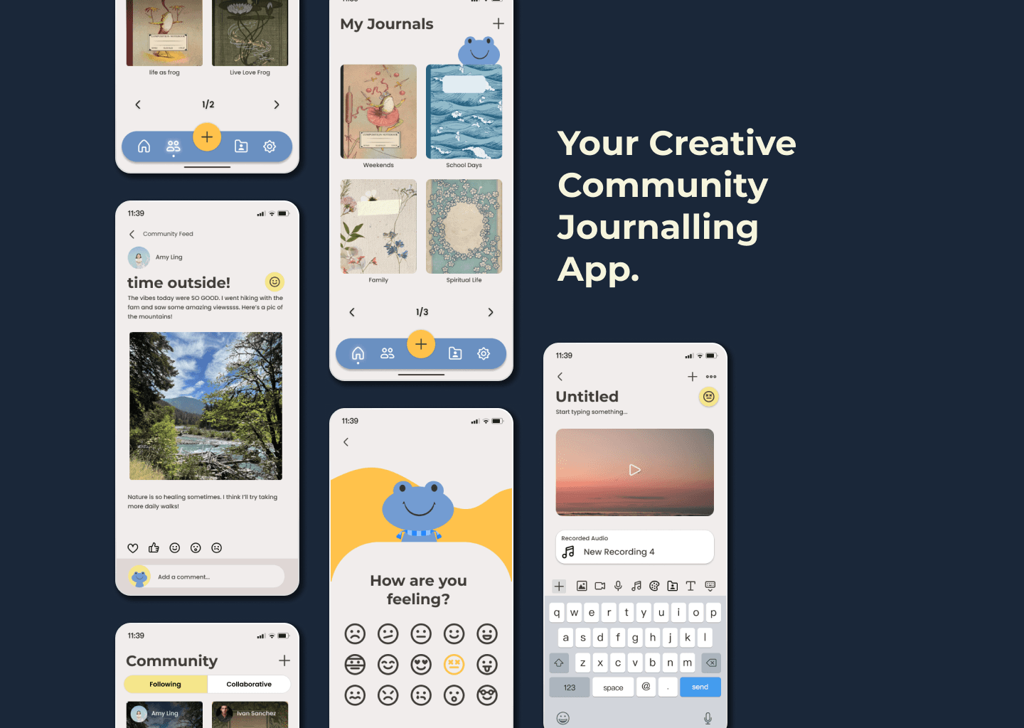
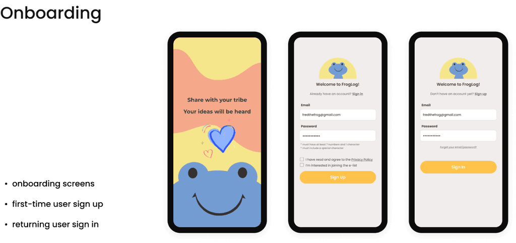
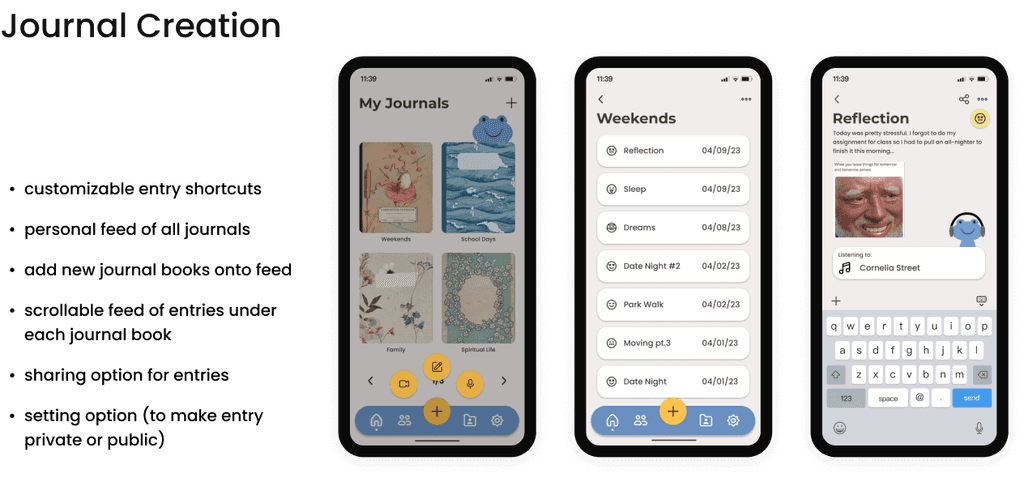
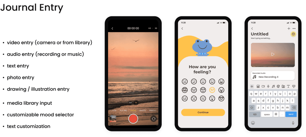
High-Fidelity Wireframes
Final Prototype Submissions
Research & Main Findings
We started by researching about the various types of communication disorders and how those with the disorders express themselves creatively.
Why is this a challenge?
From this discovery research, we noted some potential focus areas for our app:
Facial Expression & Emojis: A significant part of non-verbal communication. Recognizing facial expressions of people with neurological disorders is essential because these people may have lost a significant amount of their verbal communication ability. (source)
Music & Sound: Studies have been conducted with children with language impairment (LI). They listened to excerpts of classical music and indicated what emotion was being expressed. Children with LI identified the facial expressions of happiness, anger, sadness, and fear with the same accuracy as typical children. (source)
From these insights, we discovered that a journaling app was the format that combined the aforementioned creative options. The app would allow users to document their emotions and customize their entries with various medium.
Competitive Analysis
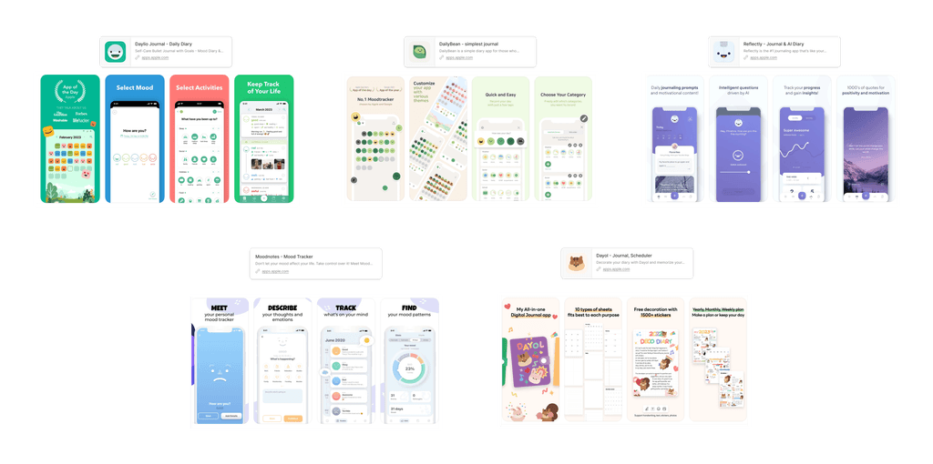
We proceeded to perform a competitive analysis of existing journaling mobile apps that share similar focuses:
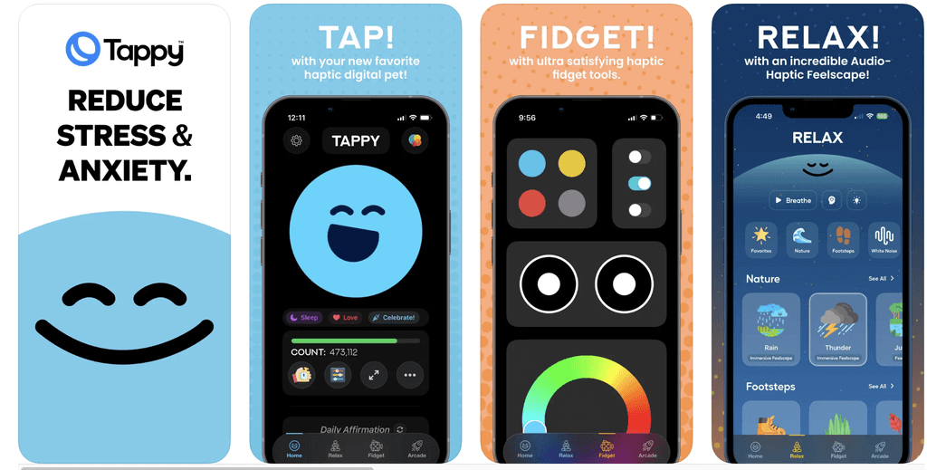
We were also inspired by Tappy, a self-care fidgeter app. The app features haptic feedback and sound effects designed to "support mindfulness, reduce stress, ease anxiety, and enhance mental health."
Through these competitors, we noted the following key attributes:
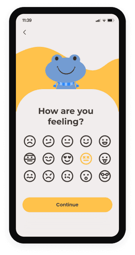
Easy selection of emojis to track emotions
Simple & bright colors making it easy for users to associate certain action items
Emulation of a real-life journal with entry/log features similar to traditional journalling
Lots of creative liberty through customization features
A missing area.
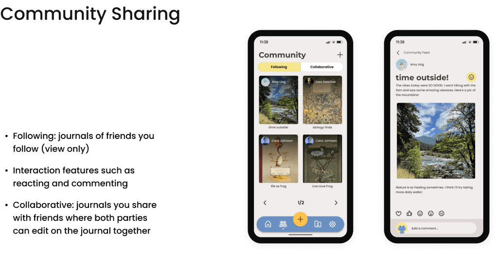
We noted that existing competitors lacked a collaborative feed, which opened up a new promising space of community journaling. This would allow users to connect with their friends and family all while focusing on private documentation.
Persona Development & User Flow
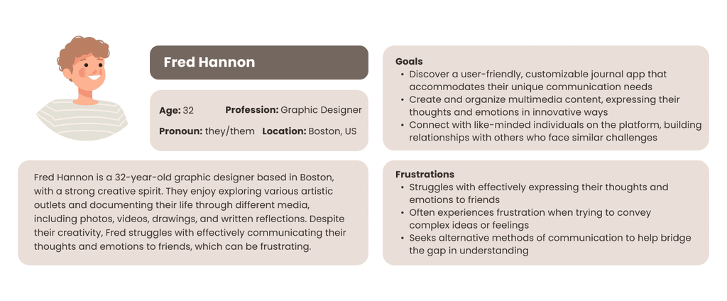
To get a better understanding for the feel of our app, we created a user persona and flow to see how the ideal user would navigate the interface.
User Persona for FrogLog
We identified the following user pain points and our solutions:
User Pain Points
Limited forms of expression & customization when journalling
Time-consuming content creation
Lack of community engagement
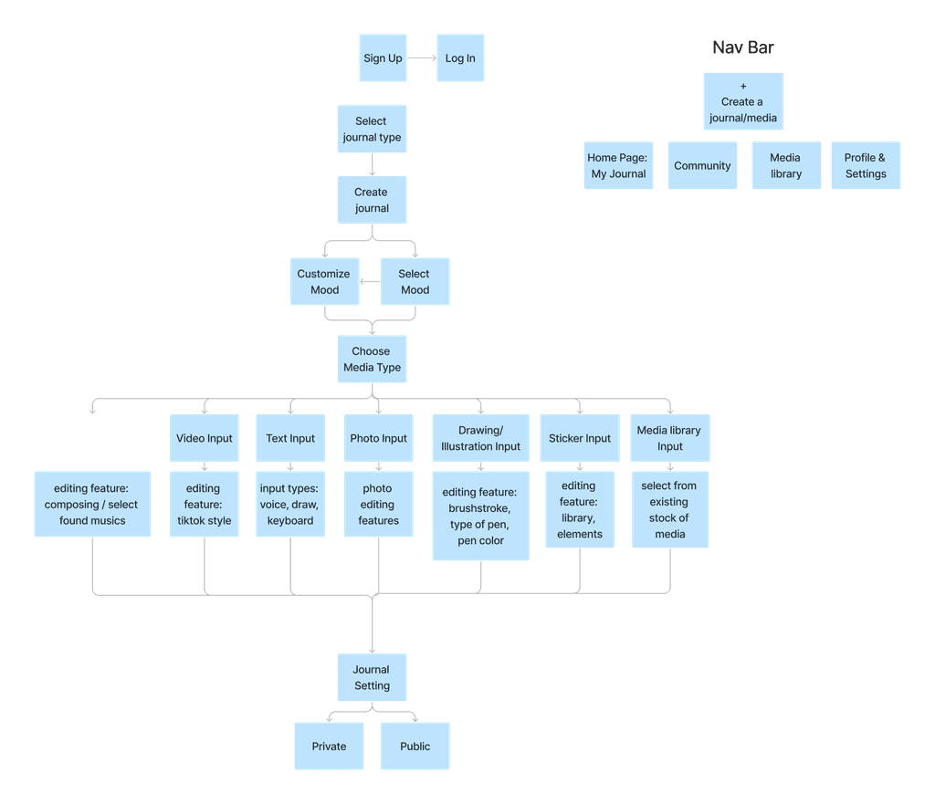
After creating our persona, we considered the 3 main functions of our journal app:
User Setting: control and account management features.
Community Features: a secondary feature, allowing users to interact with others while emphasizing the personal wellness nature of the app.
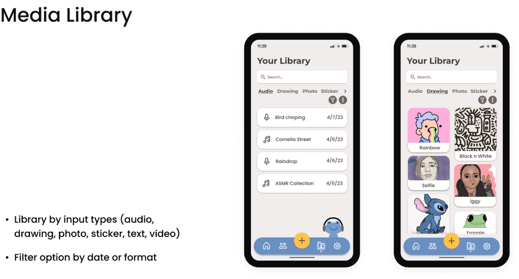
Journal Features: allowing users to express themselves through 8 different creative inputs such as video, audio, & drawing.
With these functions in mind, we created a user flow to further flush out each page of our app:
User Flow for FrogLog
Mood Board & Branding
Before building out the app in Figma, we brainstormed a mood board to help inform the visual identity of FrogLog.
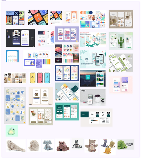
Mood boarding on FigJam
We were inspired by the earthy colors of our mood board and chose a more muted color palette so the interface is not too over-stimulating to our users. As the app is for those seeking to relax and express themselves creatively, we opted for a calming blue primary base and complemented it yellow & orange secondary colors.
We also wanted to use an animal mascot for our app. We decided on a frog -- it would act as a cute face that pops up around each page. From there, we finalized the brand colors of FrogLog:
FrogLog's colors
High-Fidelity Wireframes
With a visual identity guide and visual system selected, we started creating the wireframes for FrogLog.
Key Takeaways & Reflections
This was my first designathon and I had such a blast! Although it was quite exhausting and we ended up pulling an all-nighter to finish, I've learned a lot about designing in a fast and demanding environment.
Overall, I learned about:
Design Systems: creating design consistency with component libraries and color styles.
Task managing in a design team: delegating tasks but also ensuring a cohesive set of wireframes among 3 designers.
Competitive analyses can help identify key features but also missing areas.
Setting milestones for a fast-paced project so that each phase in the design process is not skipped but completely in a timely and efficient manner.
I will bring all of these insights forward into my design process. Here's to more designathons!
