Quabbin Quills
Designing a writing platform to empower authors to publish and receive feedback on their work.
Project Overview
I worked as the sole UX/UI Designer on my team for JumboCode. Our client was a nonprofit called Quabbin Quills (QQ), an organization that creates opportunities, collaborations, and connections for writers in the New England region.
I worked with a team of 1 Project Manager, 1 Tech Lead, and 8 Developers.
The Problem
Our client wanted a complete web redesign that highlighted the collaborative features of their writing community for their users. The current site had several issues:
The Solutions at a Glance
I designed two distinct interfaces—one for members and one for administrators—with the overall goal of creating a website that serves as a social community platform dedicated to literature. Additionally, the Quabbin Quills Design System was made.
1. Member-side Experience
2. Admininstator-side Experience
Project Scope
Streamline web interface with the key functions of the writing community, with the following main features:
Publish work
Comment on others' work
Rebrand Quabbin Quills to align with business identity and create a design system to ensure visual consistency.
Design a home dashboard that allows users to view and interact with the works of others.
Creating an admin interface that would moderate content and ban members if needed.
Initial Research
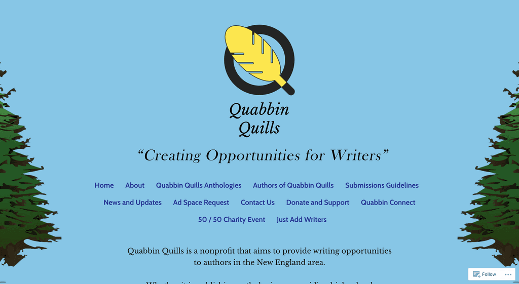
I performed a cognitive walkthrough and navigation test of Quabbin Quills (QQ) current website. Some primary issues arose that cause usability concerns:
Lack of Information Hierarchy
The heavy text cause user eye strain, making the interface unfriendly for reading dense writing.
2
Inconsistent Design Patterns
The typography and layout are not standardized, leading to accessibility violations.
3
Unclear Tasks & Functions
The abundance of functions in what is supposed to be the Nav Bar can overwhelm first-time users.
Quabbin Quills' current website
From this initial analysis, I compiled a list of main implementations the web redesign would include:
Fixed Navigation Bar
On the top of the page, a Nav Bar to guide users to the primary functions of QQ.
2
Rebrand & Design System
A rules-based design system to ensure visual consistency across pages and limit saturated colors to accent colors.
3
Standardized Design Components
Creating a component library to help with organizing information and ensure clarity across pages.
4
Defined Layout & Grids
Defining margins and grids to help declutter the user interface.
User Flow & Task Analysis
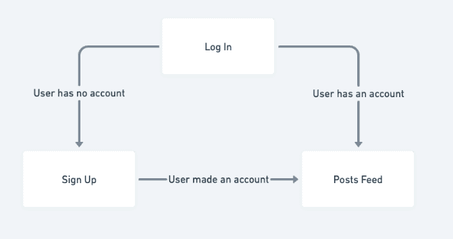
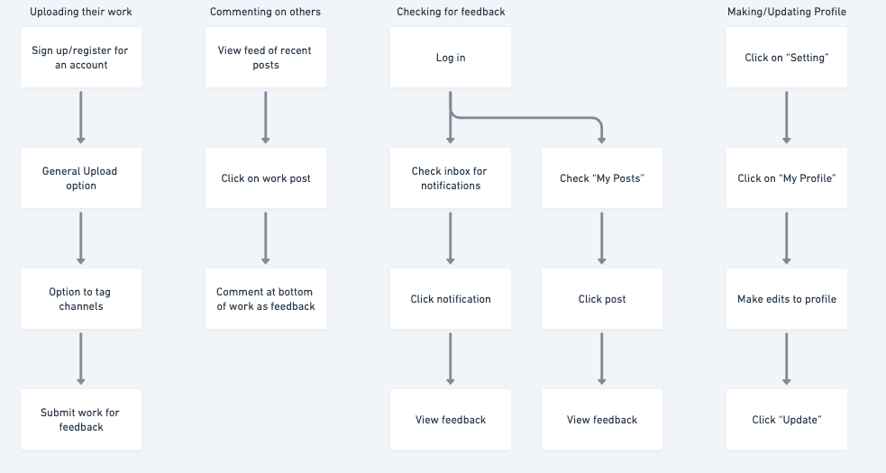
Using Whimsical, I visualized the mind map of a user navigating through the page; taking in mind the main tasks the user is set out to do:
Task 1.
Log in and sign up
Task 2.
Uploading their work
Task 3.
Interacting with other users
Task 4.
Checking for feedback
Task 5.
Making and updating profile
User Flow Diagram
Creating this diagram was critical in defining what I would put in the navigation bar. The initial nav bar included the following:
Translating into Low-Fidelity Wireframes
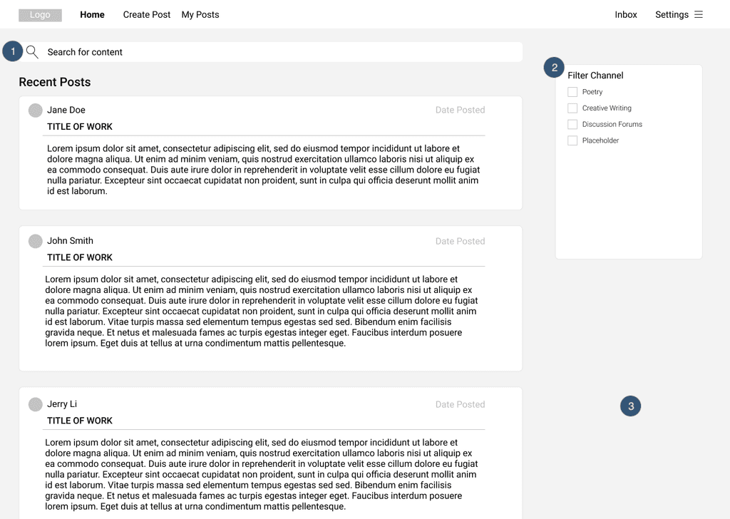
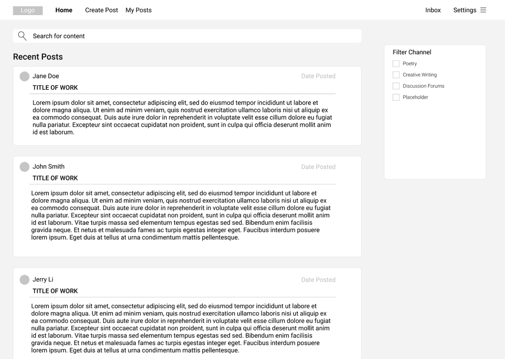
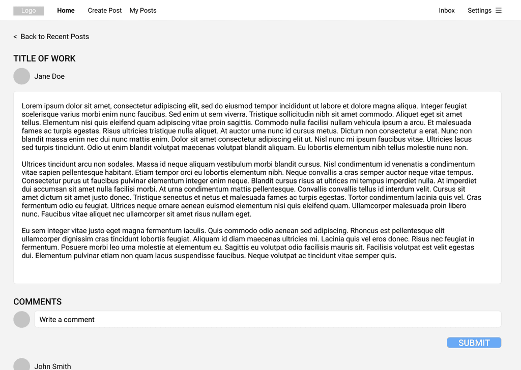
Taking in mind the user flow charts and cognitive task analyses, I developed low-fidelity wireframes for each component of the web. Below are demos of main tasks:
Task: Log in / Sign up
Task: Uploading work
Task: Commenting on work
Task: Checking for feedback (1 of 2 ways)
Other notable low-fi features:
1. Search Bar: as more work gets published, users can search for specific work.
2. Filter Channel Box: users can filter posts based on the genre.
3. Infinite Scroll: provide users a seamless access to older posts.
4. Access to User Profiles: users can interact with other writers by going on their profile page and accessing their other works.
User Testing & Admin Feature Discovery
I user tested across of sample of 25 participants from colleagues to QQ users and noted some take-aways:
Redunant Navigation Bar
"My Posts" displayed the same content as the "My Profile" page. In addition, it took users awhile to find "Create Post"
Confusing Navigation Labels
The button label for "Settings" was confusing as most users did not know it would open a drop-down menu leading to "My Profile", "Preferences", and "Log Out"
Inability to Recover from Errors
Some users were frustrated by the lack of warnings for drastic actions, such as deleting a post.
Poor Readability
As this was a writing platform, displaying text in such wide margins led to poor readability and eye strain.
After presenting the low-fi wireframes to our client, I received the following feedback:
After a few whiteboarding sessions, my team decided on a separate admin interface that would include moderator controls, such as creating channels, deleting posts and comments, and banning accounts, addressing key client concerns.
Creating a Design System for Visual Consistency
Before designing the high-fidelity wireframes, I created a design system to ensure visual consistency. The design system would also provide UI specifications and documentation for future developers and designers. To build it, I first established Quabbin Quills' branding.
Branding
The client wanted a rebrand of their website that embodied the essence of the Quabbin Reservoir in Massachusetts. I made the following design decisions:
Heading fonts as a serif typeface to give a scholar feel.
Body fonts as a sans serif typeface for readability.
Color palette to feature earthy green and blue tones reminiscent of the Reservoir.
Quabbin Quills Design System
Using an initial spec sheet as visual reference, I created the Quabbin Quills Design System which can be accessed here.
Notable Design Changes
Nav Bar Redesign: Reducing Redundancy and Improving Discoverability
Before
Poor discoverability of main functions like 'Create Post'
Redundant page destinations: 'My Posts' duplicated content from 'My Profile'
Confusing navigation structure: users didn’t realize 'My Profile' and 'Preferences' were nested items
After
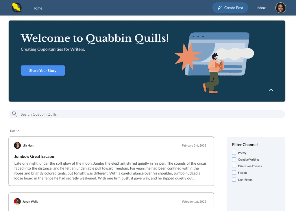
Different button design for "Create Post" to improve discoverability
Nested 'My Profile,' 'Settings,' and 'Log Out' under a profile icon to reduce text and follow standard design patterns
Incorporated brand colors to enhance visual contrast and reinforce Quabbin Quills branding
Home Page: Creating Visual Hierarchy through Layout, Color, and Typography
Before
Poor text alignment and hierarchy created visual clutter
Lack of feed customization: posts are sorted only by most recent
No distinct branding or personalized touches
After
Improved vertical alignment for better readability
Replaced the 'Recent Posts' heading with a sort button, allowing users to view posts by Recent, New, or Top
Established a text hierarchy using varied font weights, sizes, spacing, and colors
Added a collapsible banner at the top to incorporate brand personalization and style
Page-wide Changes: Improving Accessibility and Readability
Before
Narrow line height made paragraphs difficult to read
Wide margins reduced scannability, particularly in denser text sections
Accessibility issues: buttons failed to meet WCAG 2.0 Level AA contrast ratio requirements for large texts (3:1)
After
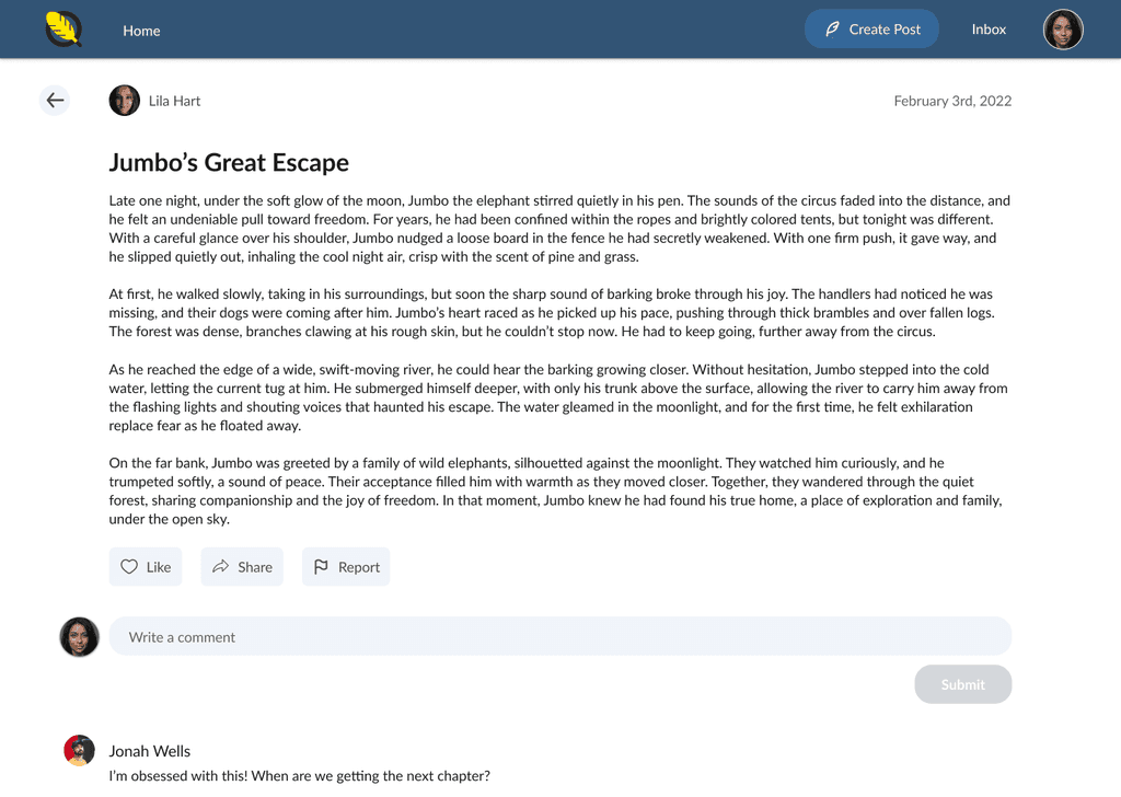
Set line height to 1.7 (170%) for body text
Removed unnecessary styles and uppercases; substituting with icon buttons for consistency
Narrowed margins to limit characters per line to under 150
New button design meets WCAG 2.0 Level AA guidelines with a contrast ratio of 3.35:1
All interface elements pass the 3:1 contrast ratio, and all text elements meet the 4.5:1 contrast ratio!
Putting It All Together: Final Design
Using the design system, I designed the hi-fi wireframes. Demos for the key tasks are below:
Interacting with Other Users
Editing & Deleting Posts
My Profile & Settings
Admin Interface
Beyond the user-side interface, I also designed what the admin interface would look like. Some key differences include:
Nav Bar: Channels, Members, and Reports.
Channels: delete, edit, and create channels.
Members: grid offering at-glance information on members with a side panel to provide more insights.
Reports: view reports on comments, posts, and members.
Ban controls: privately message and ban members.
Editing Access: delete comments and modify posts.
Key Takeaways & Reflections
From this year-long project, I learned a lot about designing a web interface that accommodates both client and user needs. This was my first time designing a full web interface from start to finish. I had the opportunity to dive deep into user research and carefully consider the interactive features across each page.
If I had more time…
More user testing: I would test my final designs to assess whether the new changes are effective and evaluate readability across pages.
Further accessibility design: I would push my UI design components to meet WCAG Level AAA guidelines as well.
Overall, I learned:
Designing for accessibility: This process taught me a lot about WCAG 2.0 Level AA guidelines and how to design a more inclusive experience.
Design systems are important: They establish visual rules and consistency, making it easier for developers to translate and increasing efficiency, especially if the website scales.
Information hierarchy matters: Guiding the user's eye as they navigate through a page is essential. Grouping related elements and establishing a clear text and component system makes a significant difference.
Effective communication with cross-functional teams: I collaborated with a team of 8 developers, 1 PM, and 1 tech lead, where I had to clearly explain my design iterations, always keeping the users' best interests in mind.
The final design prototype has been developed and shipped to our client, who will use this streamlined interface as a reference for their developers. And that’s a wrap!

