GitLab
Improving the usability of GitLab's issue boards by helping Project Managers identify work in jeopardy.
Project Overview
As part of my senior capstone for Human Factors Engineering, I worked on a GitLab sponsored project focused on improving the usability of GitLab's issue boards.
About GitLab
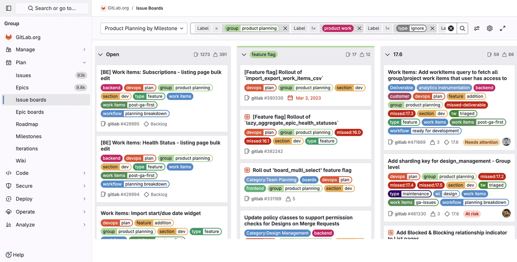
GitLab is an AI-powered DevSecOps platform for project planning and source code management. The GitLab issue board is a software project management tool used for the workflow of a feature or product release. It can be used as a Kanban or a Scrum board.
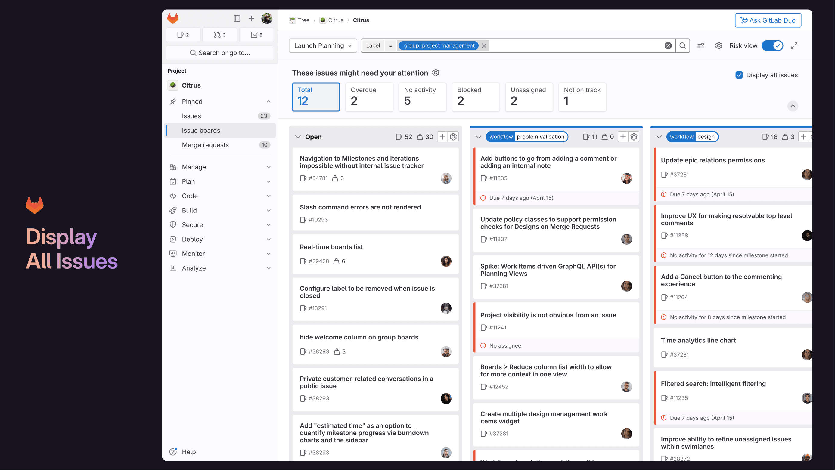
A Project Manager's issue board on GitLab
My Role
As a Product Designer, I contributed to the entire design process. My focus was on UX Research and Content Design so I was more involved with creating research questions, interviewing users, synthesizing research notes, and assisting with UX writing.
The Problem
The original problem scope was to improve the usability of GitLab's issue boards. This was too broad so with discovery and user research, we narrowed our problem statement into the following:
Currently, it can take up to 45 minutes to figure out what’s at risk and what’s not. This is due to to difficulty in understanding progress at a glance and a lack of jeopardy indicators.
The Solution at a Glance
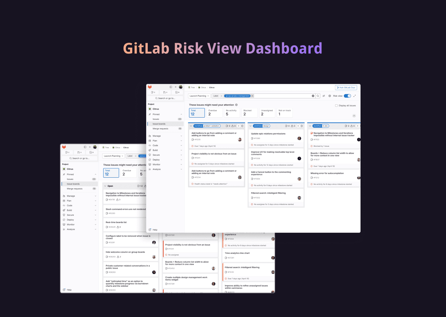
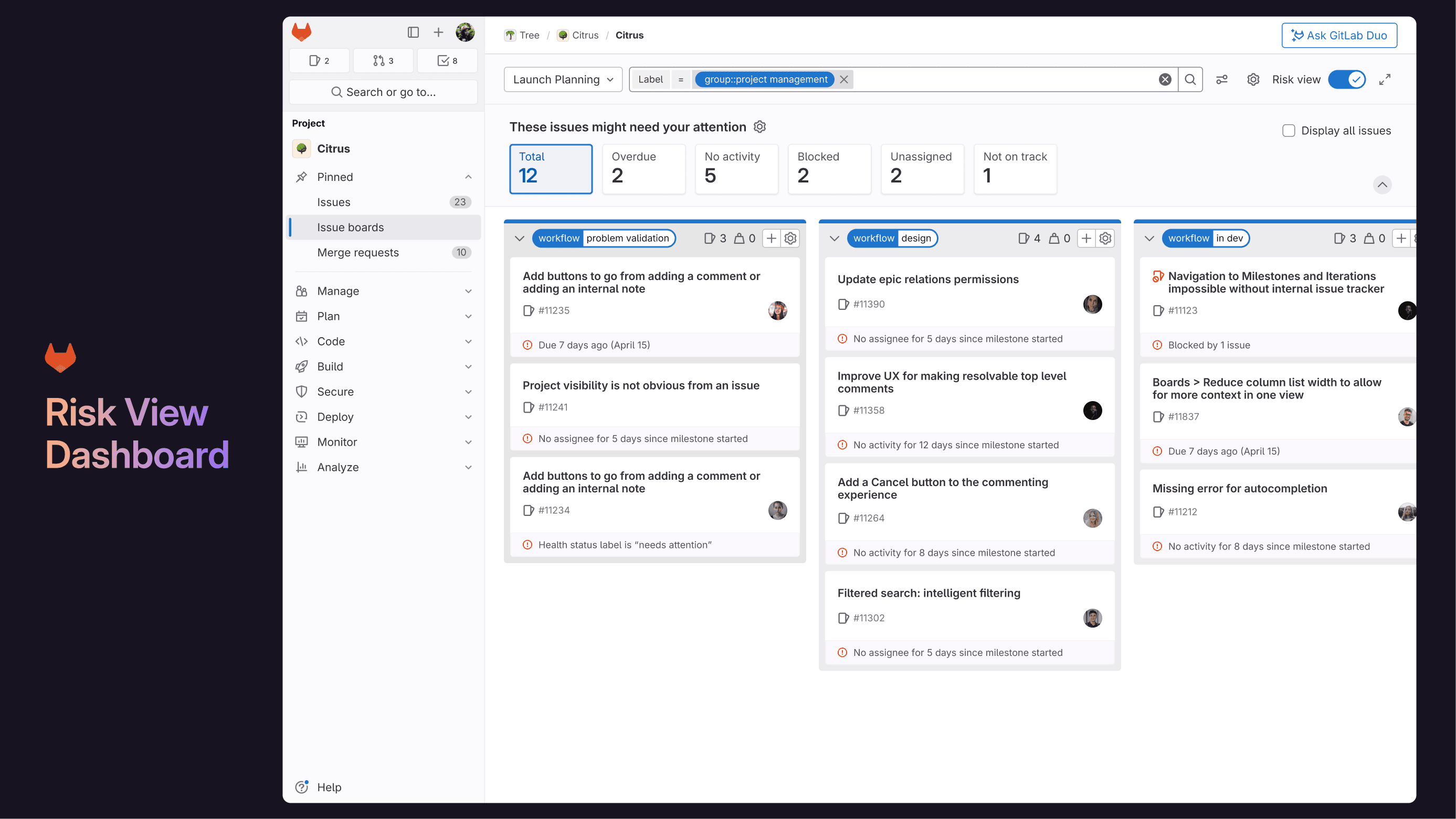
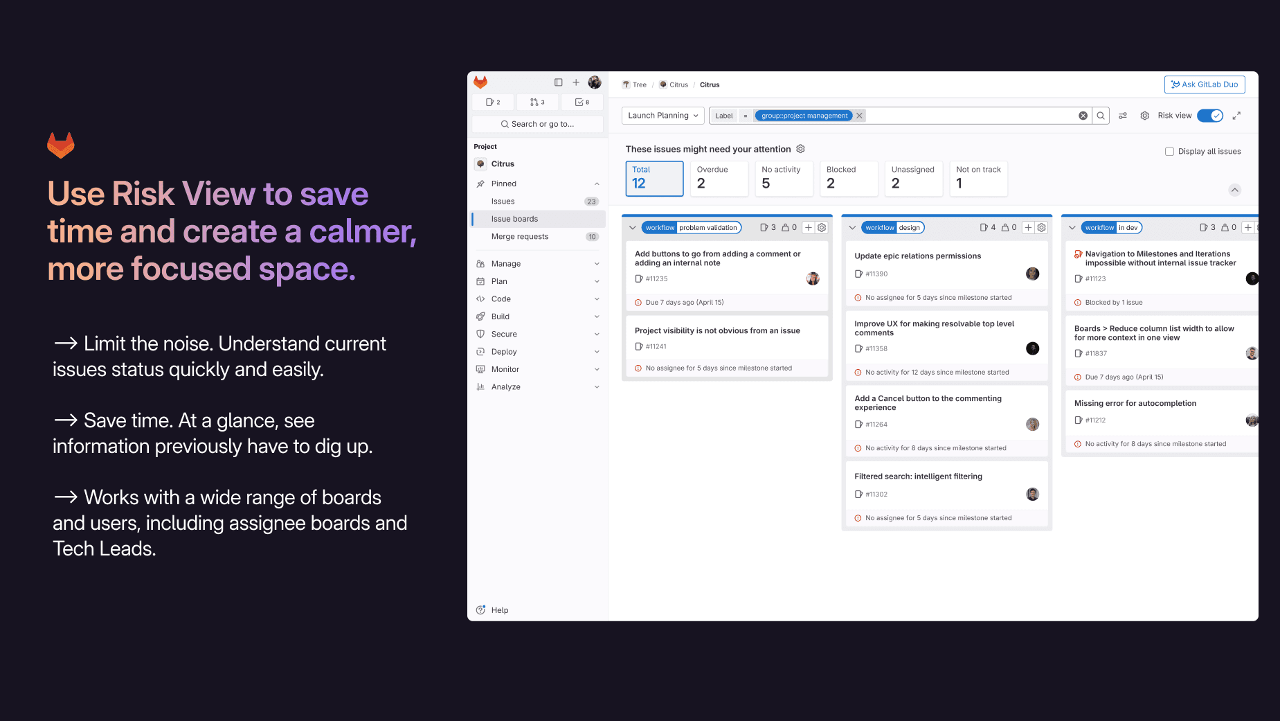
We designed a risk dashboard that highlights work in jeopardy at a glance, reducing the time it takes to identify risks from 45 minutes to seconds.
Getting to Know GitLab & the PM Space
As no one in my team have used GitLab's issue boards, we wanted to first understand the product. To do this, we watched online videos of GitLab users setting up issue boards and created an object mapping diagram to map the relations between epics and sub-epics.
We also conducted comparative and competitive analyses across agile-planning and project management tools. GitLab's primary competitor is Jira but we extended our research to include Trello, Asana, Monday.com, and Clickup.
Roadblock & Pivoting into Guerrilla Research
The Nondisclosure Agreement (NDA) was delayed which meant we couldn’t access any of GitLab's users or internal resources.
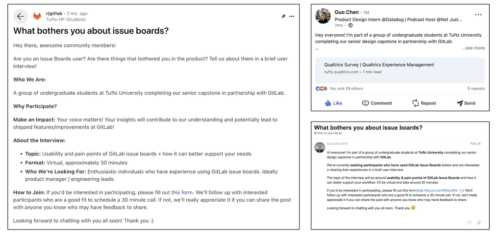
We pivoted into guerrilla recruiting through Reddit, LinkedIn, Discord, and GitLab's forum. With each platform, we worked with GitLab’s UX research team to optimize our recruitment content. Our main goal for this set of interviews was to understand how users interact and think about GitLab's issue boards.
Guerrilla Recruitment Templates
From this, we were able to interview 6 participants. However, this sample size was small and our participants were very diverse in their roles, company type/size, and had varying usages and experiences with issue boards. We synthesized our findings with an affinity map and found 12 common themes.
While there were overlapping themes, we weren't able to get an accurate understanding of these themes as our participants were too varied with roles including engineering manager, product manager, and developer. These roles all use issue boards differently so we couldn't form a conclusion on which workflow to focus on.
Distilling User Research into Key Insights
The good news: our NDA was approved at this point!
To conduct a more focused research, we looked towards GitLab's existing persona research and held discussions with the design team to determine the most impactful personas. We landed on two personas for the issue board: a Product Manager (PM) and an Engineering Manager. These two personas have the most interactions with issue boards.
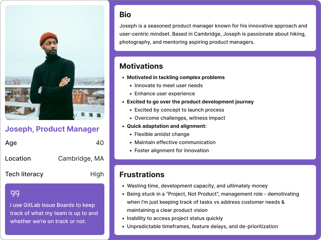
Primary Persona: Joseph the Product Manager
Based on insights from GitLab's PM Plan team, we chose to focus on Joseph, the Product Manager, because his tasks (creating and tracking issues) align closely with GitLab's existing research on viewing work status. This research also revealed usability issues in these tasks, guiding our decision to center our design on improving the related jobs-to-be-done (JTBD).
Narrowing Down the Scope
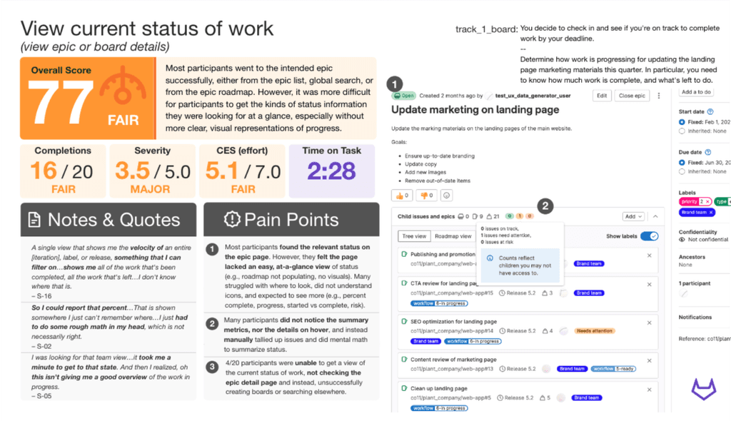
After reviewing existing research from GitLab, we found that the task "view current status of work" had an overall score of 77, which was significantly lower than other task ratings. Our interview findings highlighted frustrations similar to this task so we narrowed our problem scope to focus on PMs identifying existing at risk issues.
GitLab's Research on "View current status of work"
Interviewing PMs to Define Their Pain Points
We conducted a more focused research with 7 PMs from GitLab and other companies. The goal of the research was to better understand their current workflow with identifying work in jeopardy along with any pain points they may have with issue boards
🌟 The 2 main insights
Understanding Progress
Jeopardy Indicators
PMs struggle to understand current progress right away due to overwhelming UI, a complicated search process, and a lack of big picture.
Project Managers (PMs) and Tech Leads need dig around to find out whether people are working on a project as there's a lack of status indicators.
Based on these findings, we narrowed down and refined our problem statement:
"As a product manager, it’s hard for me to understand the current status of issues right away on Issue Boards."
Translating Insights into Designs
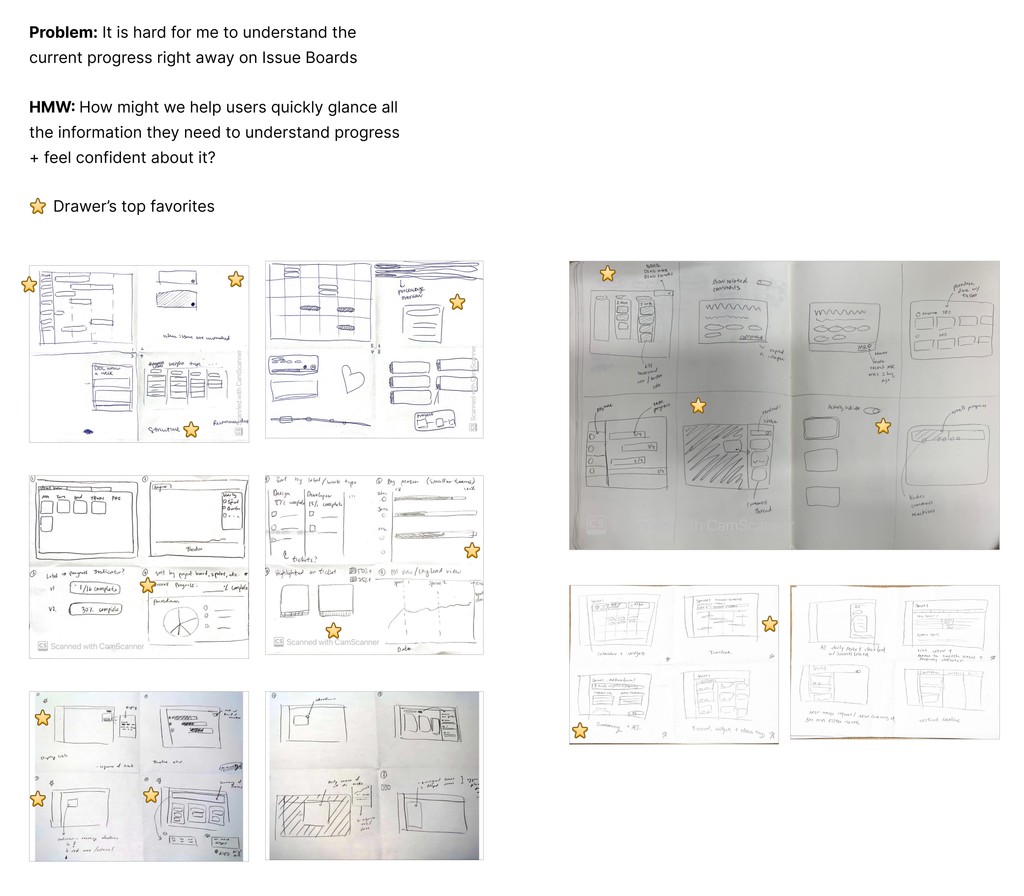
Ideating with Crazy 8's
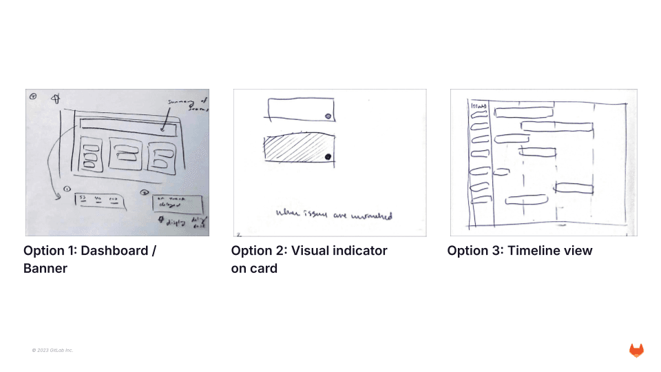
We did several rounds of Crazy 8's to brainstorm ways to address our problem statement. From there we voted and narrowed down to the top 3 design directions.
Top Design Directions
Mid-fidelity Wireframes
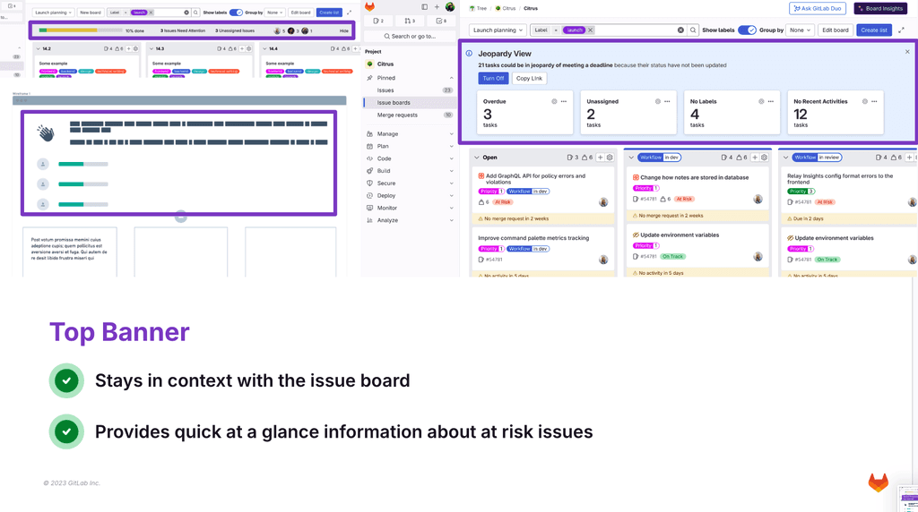
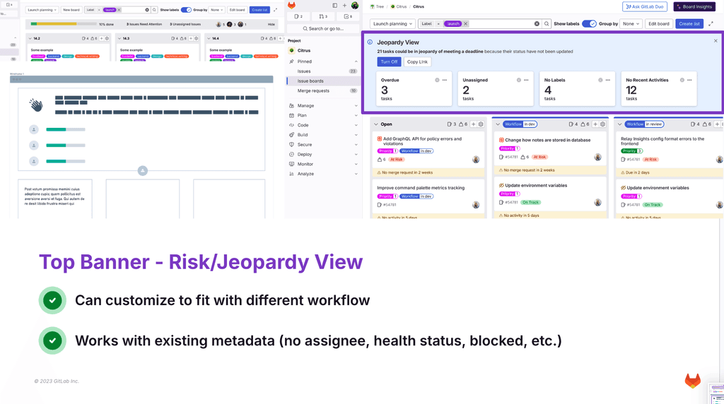
Out of the different configuration options, we chose the dashboard/banner as it was a configuration that can fit into different PM workflows while allowing providing them with context to other issues.
Chosen Banner Configuration
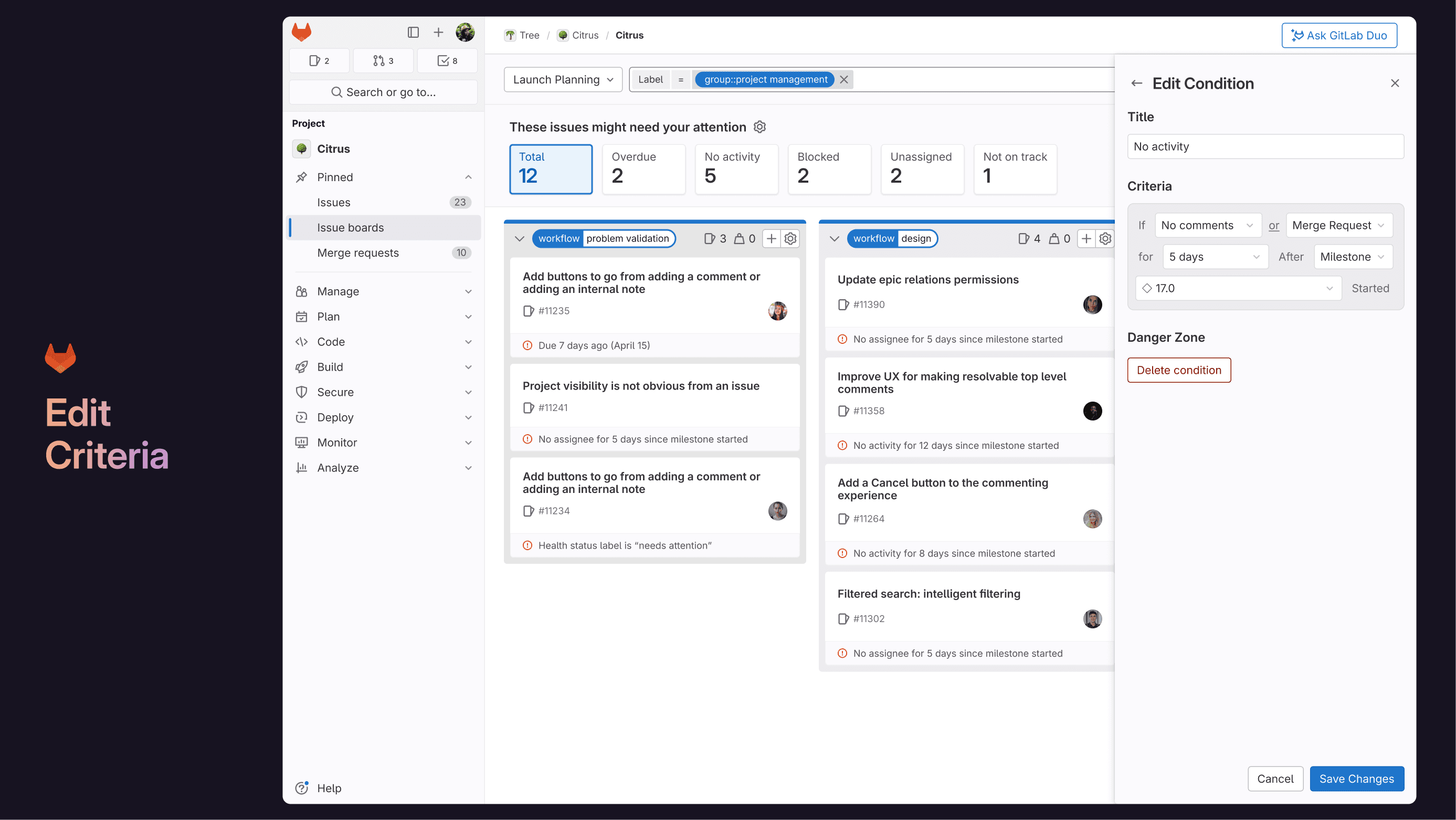
More specifically, we chose a top banner configuration that would serve as a risk/jeopardy view.
Risk/Jeopardy View Banner
Concept Testing
We chose two concepts to test with 5 participants (4 GitLab / 1 non-GitLab) and gave them tasks to complete.
Concept 1:
Top Banner + Filter
Concept 2:
Risk View + Cards
💫 Insights
All of them prefer Concept 2!
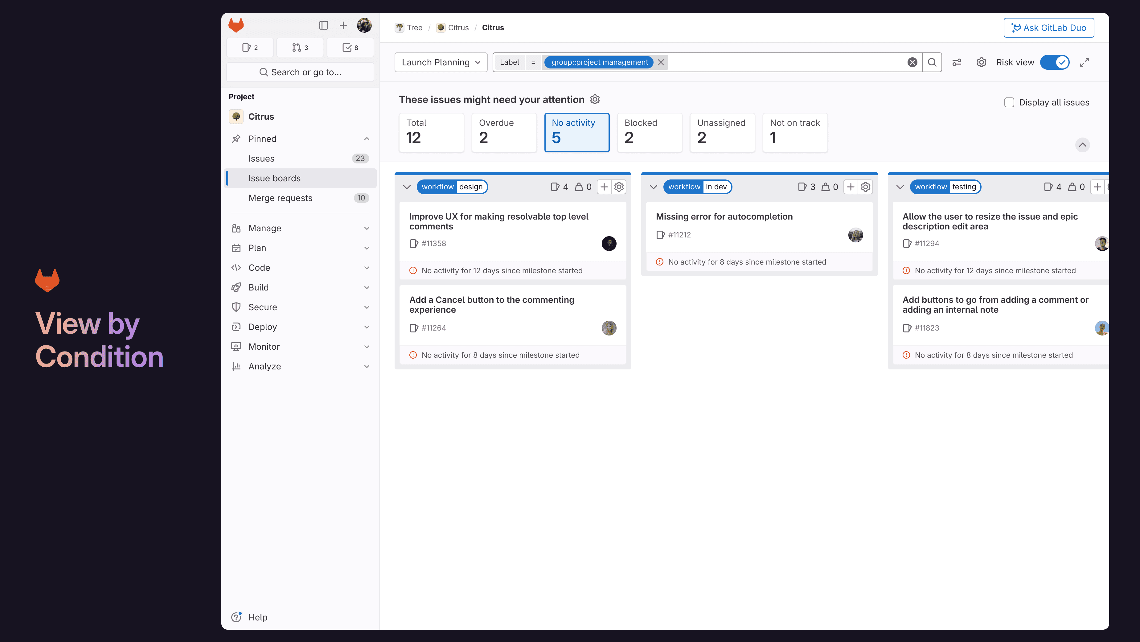
Love that they can quickly glance what, how many, and why issues are at risk.
See at risk issues with the other issues
This can help PMs understand the big picture & assign people accordingly.
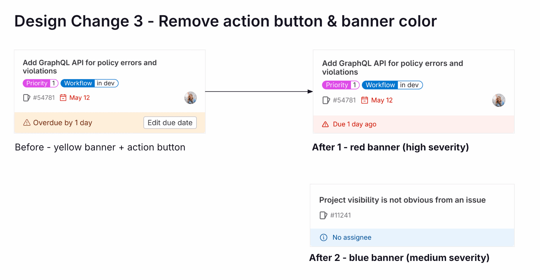
Do we need the action button?
Normally PM need to click into issue to get more context to make a decision.
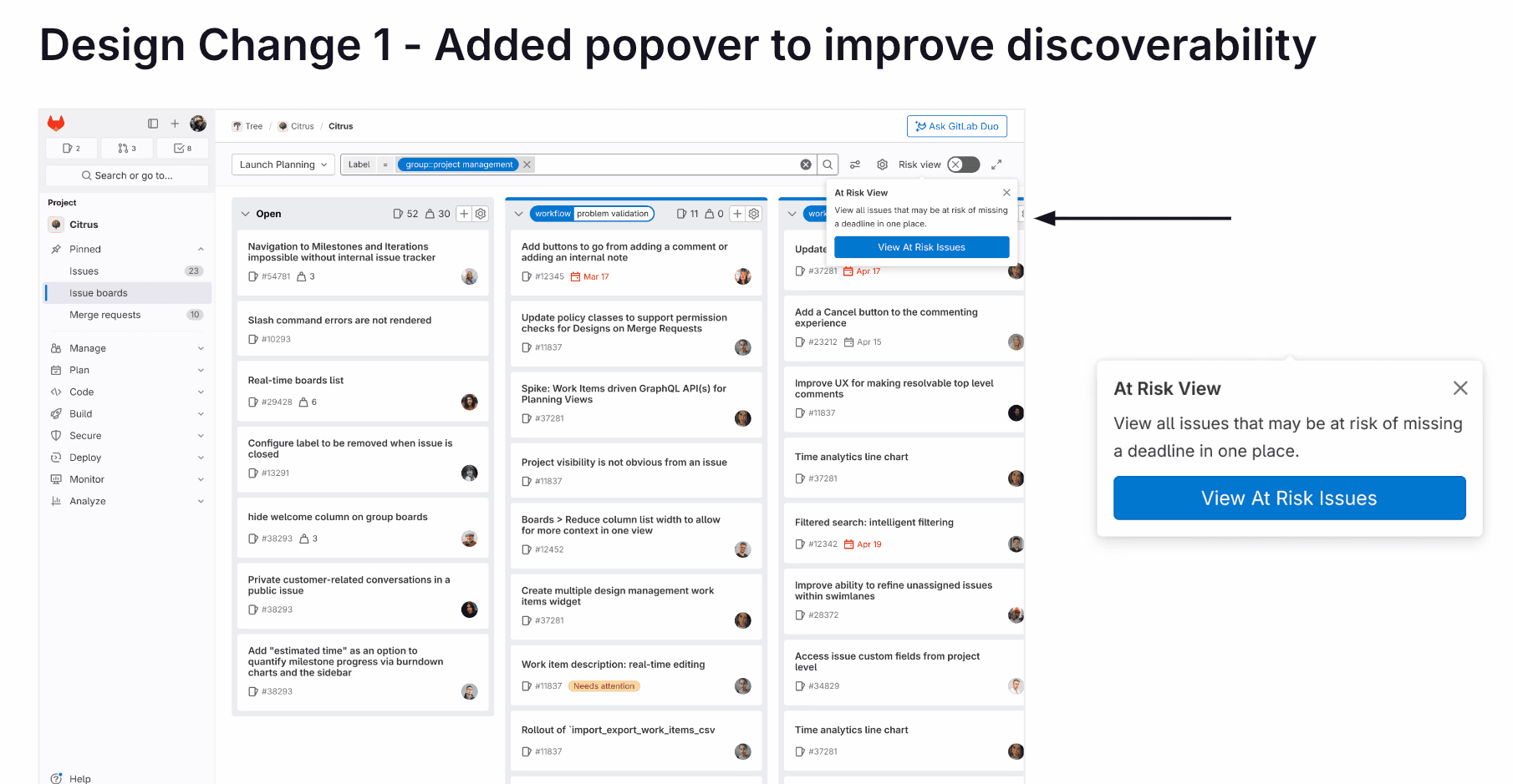
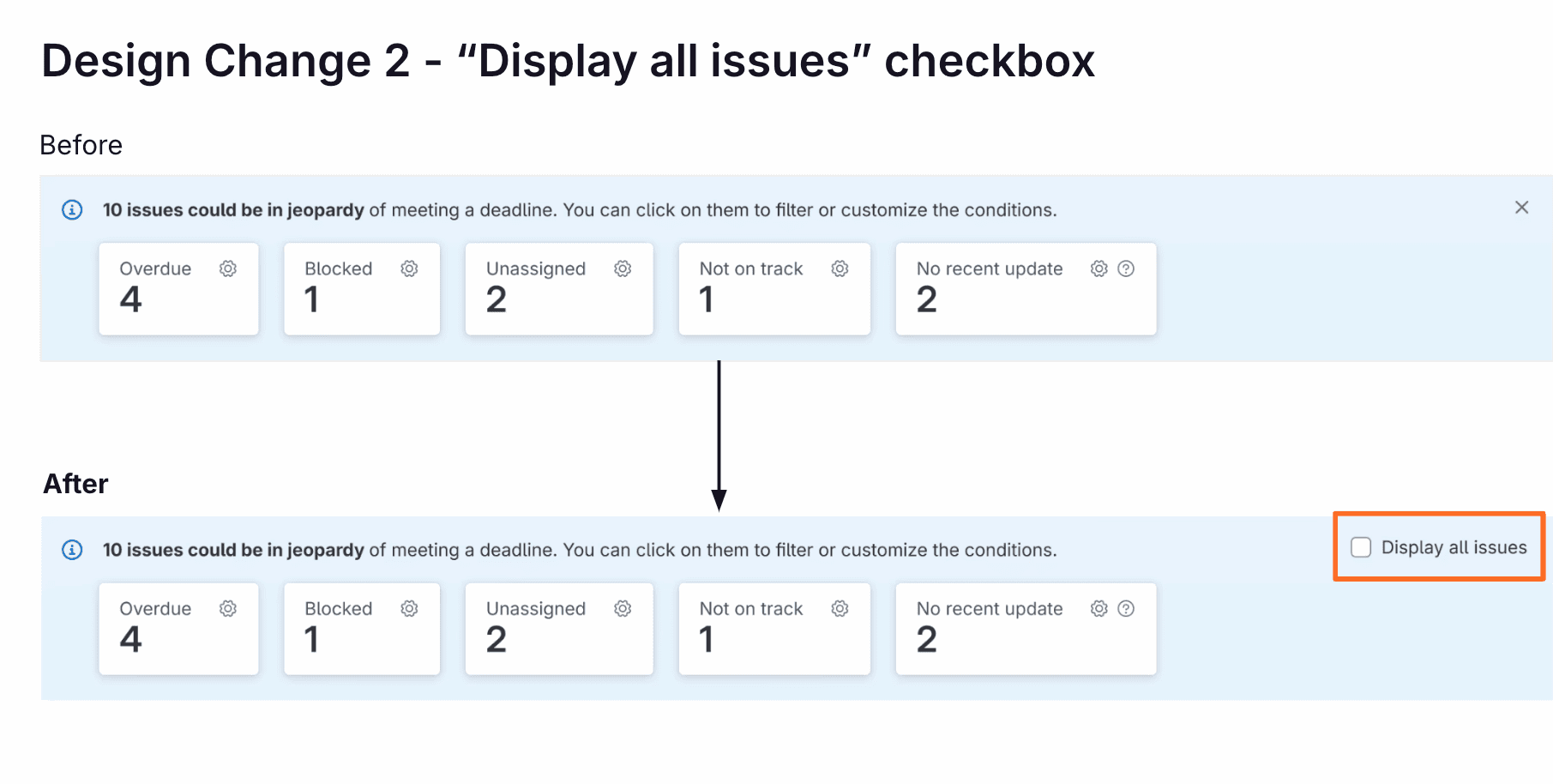
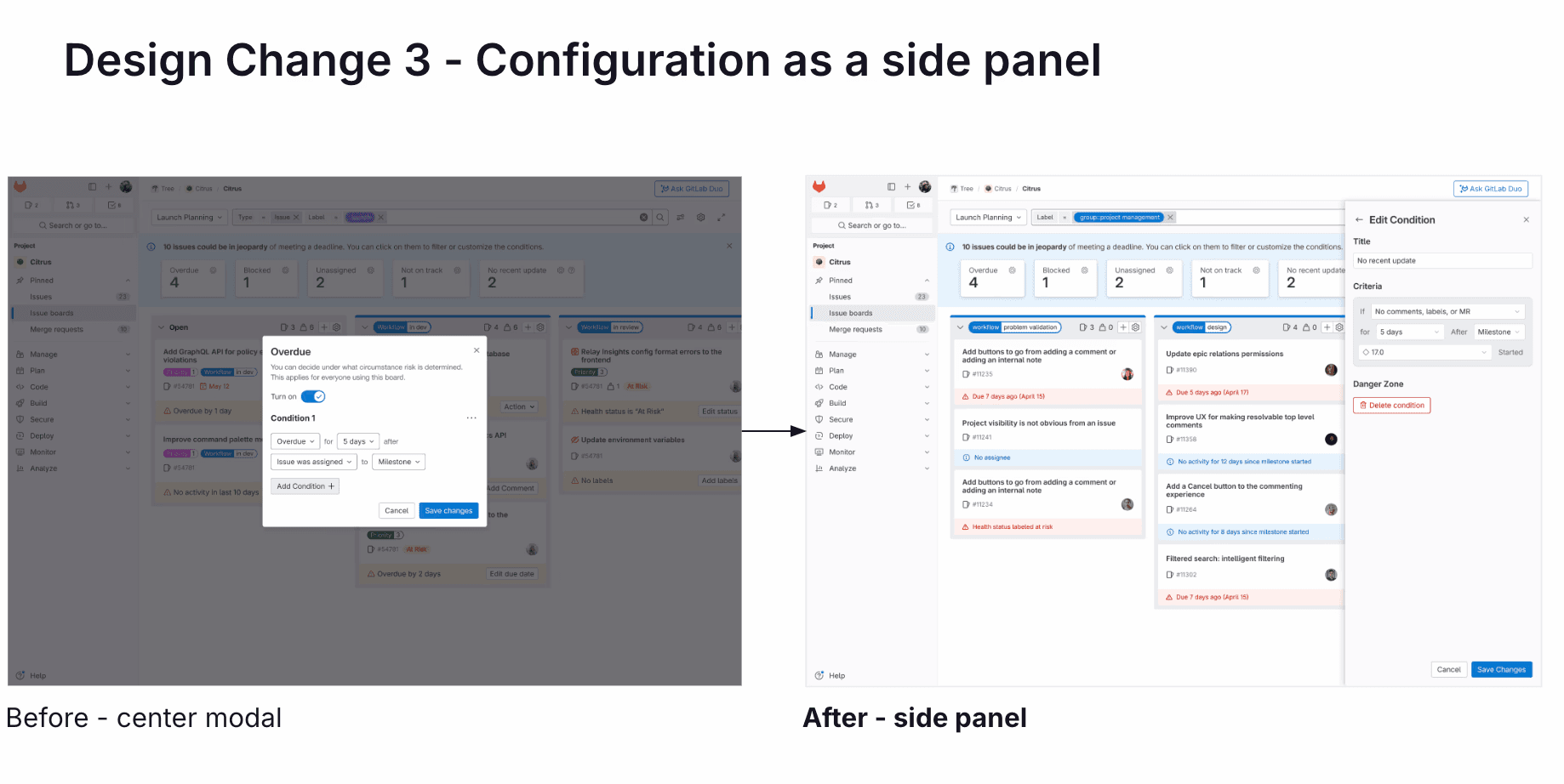
Incorporating Feedback into Design Changes
Usability Testing
User Tasks
With our new design, we conducted a usability test with 5 non-GitLab participants -- most of them don't use GitLab issue boards. We assigned them 2 tasks:
Task 1
Identify at risk issues on issue boards.
On a scale of 1 - 5 (1 is not confident at all, 5 is very confident), how confident do you feel about completing this task?
Results
We asked participants to rate their confidence in task completion from a scale of 1-5 (1 being not confident at all and 5 being very confident). This score was raised from the previous average score of 3-4!
Task 1
Identify at risk issues on issue boards.
5/5 in task completion 🎉
💫 Insights
Do look at metadata but not all
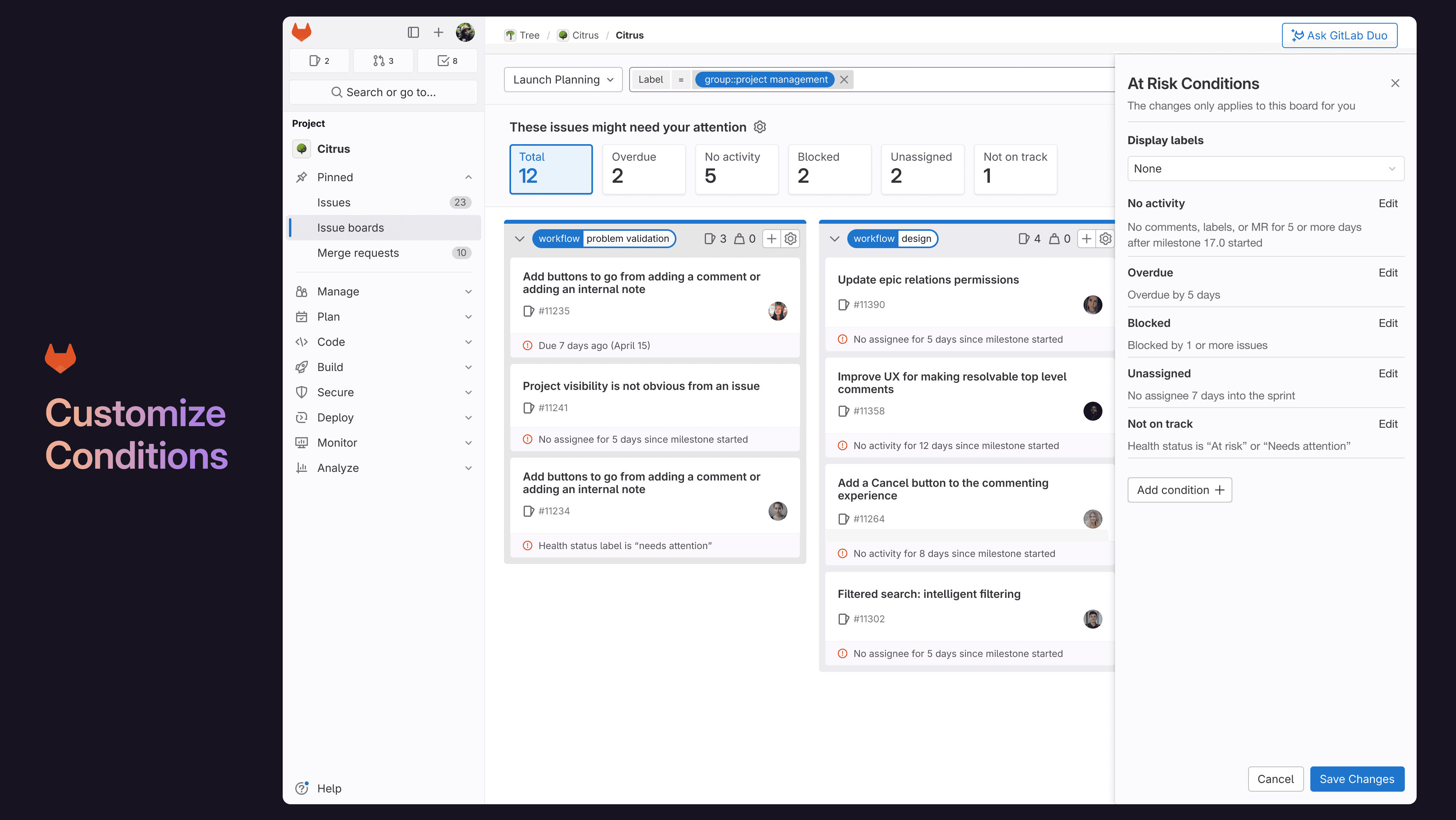
PMs do still look at labels but not all of them. This varies based on the PM's team, preferences, and habits.
Ambiguous definition
Some participants find “no activity” and “not on track” to be unclear; some find “no activity” irrelevant.
The Final Design
Using the feedback from usability testing and GitLab's Pajamas Design System, we created our final design prototype.
Feedback & Learnings
Feedback
"The project was very professionally done and the story came out clearly. You all did a great job."
GitLab Senior Product Designer
Learnings
This project has pushed me to be a more thoughtful researcher and designer. I learned so much from GitLab's Product Designers, UX Researchers, and PMs!
Some main learnings include:
Guerrilla recruitment & research strategies
Testing various structure and content to optimize response rate and designing effective questions for user research sessions.
Distilling research into key insights
I learned how to use tools such as Dovetail to synthesize user research into qualitative findings and narrow down a scope.
Working in the DevSecOps space
This was my first time working in such a technical setting so I had to familiarize myself with the terminology & agile planning process of PMs.
Designing for the JTBD framework
Stopping myself from solutionizing and think through each step in the JTBD and consider what the user needs.
Importance of ideation
The original designs were a lot different from where we ended up but ideating throughout allowed us to consistently receive feedback.
Complexities within a system
Being more intentional about each design decision as it can affect different personas, setups, and accessibility.
💛 A special thanks to Professor Borghesani and the GitLab team: Gina Doyle, Chad Lavimoniere, Amanda Rueda, Nick Leonard, Marcin Sędłak-Jakubowski, Danika Teverovsky, and Ben Leduc-Mills.
