Instructables
Transforming the cooking experience for aspiring home chefs.
Project Overview
I had to design an instructional app for my Computer Interface Design (ENP166) class that will teach people how to do something, and about that topic.
The Prompt
Develop a micro-app with the goal of teaching someone HOW to do something and teach ABOUT what they are doing.
What are Instructables?
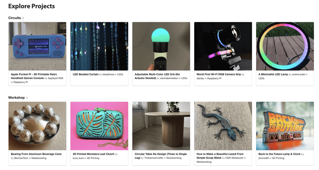
Founded by Autodesk, Instructables is a website that features user-created and do-it-yourself projects that are formatted step-by-step.
Example of Instructables
Process
Concept Development
Visual Design & Moodboarding
Wireframes & User Testing
Final Project Submission
The Problem
People on the rush look for quick and straight-forward recipes that they can make without all the complications from current online recipes. Existing online recipes are very wordy and often lack an informative component teaching uses about the health benefits behind ingredients they’re consuming.
The Solution
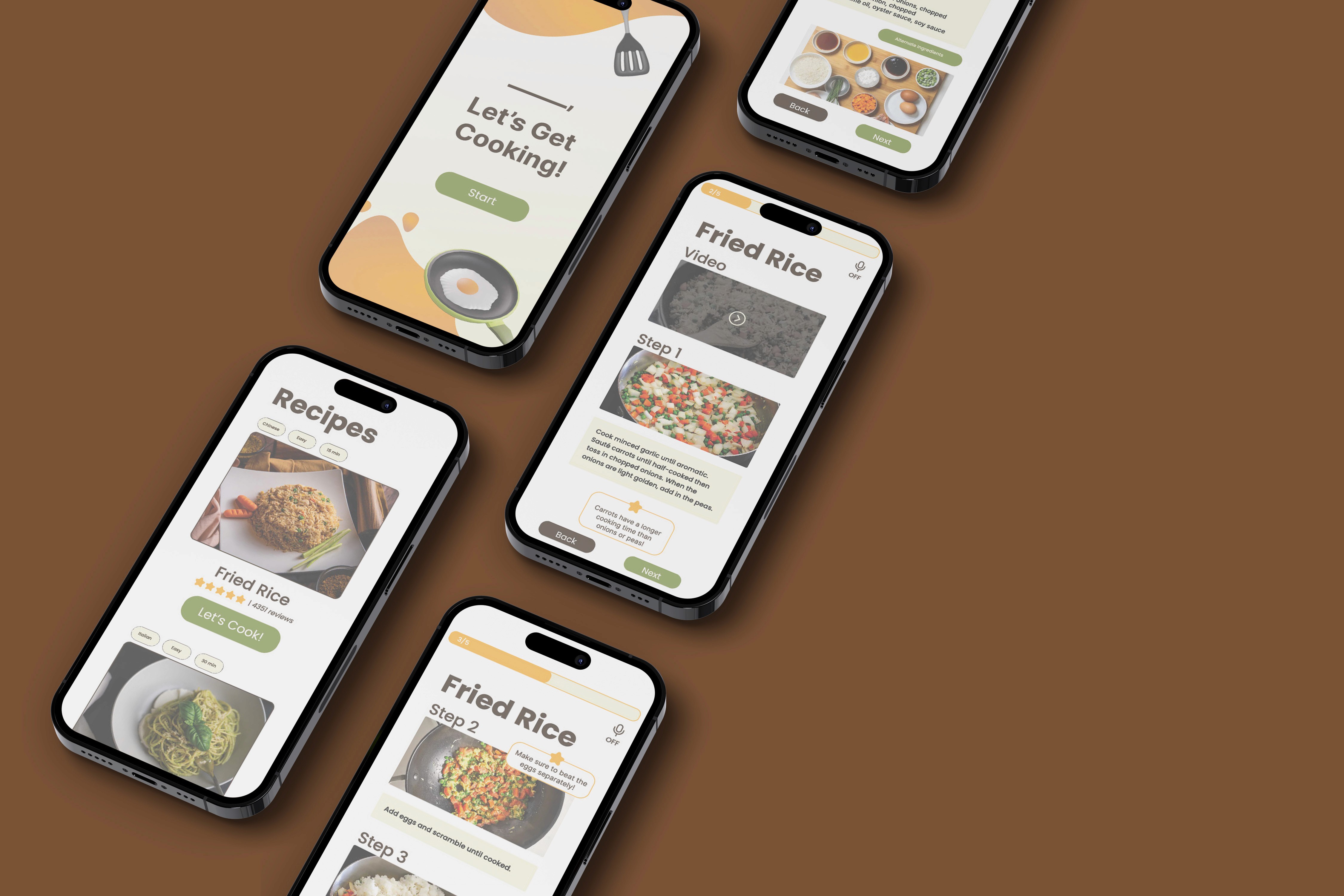
My solution to this problem is to create a visual heavy recipe with 1-2 sentences for each step on the instructions. My recipe will also include adaptability and allow users to switch out ingredients and find alternate substitutes.
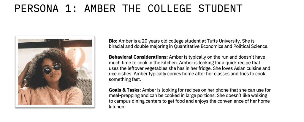
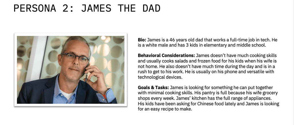
Meet the personas.
Through these personas, I chose to further develop the concept of cooking fried rice as fried rice is a staple recipe in Chinese cuisine and its flavor variability makes it a culturally complex dish. This concept can be educational in teaching people about Chinese culture and is a delicious and easy recipe that most can make with what they have in their kitchen.
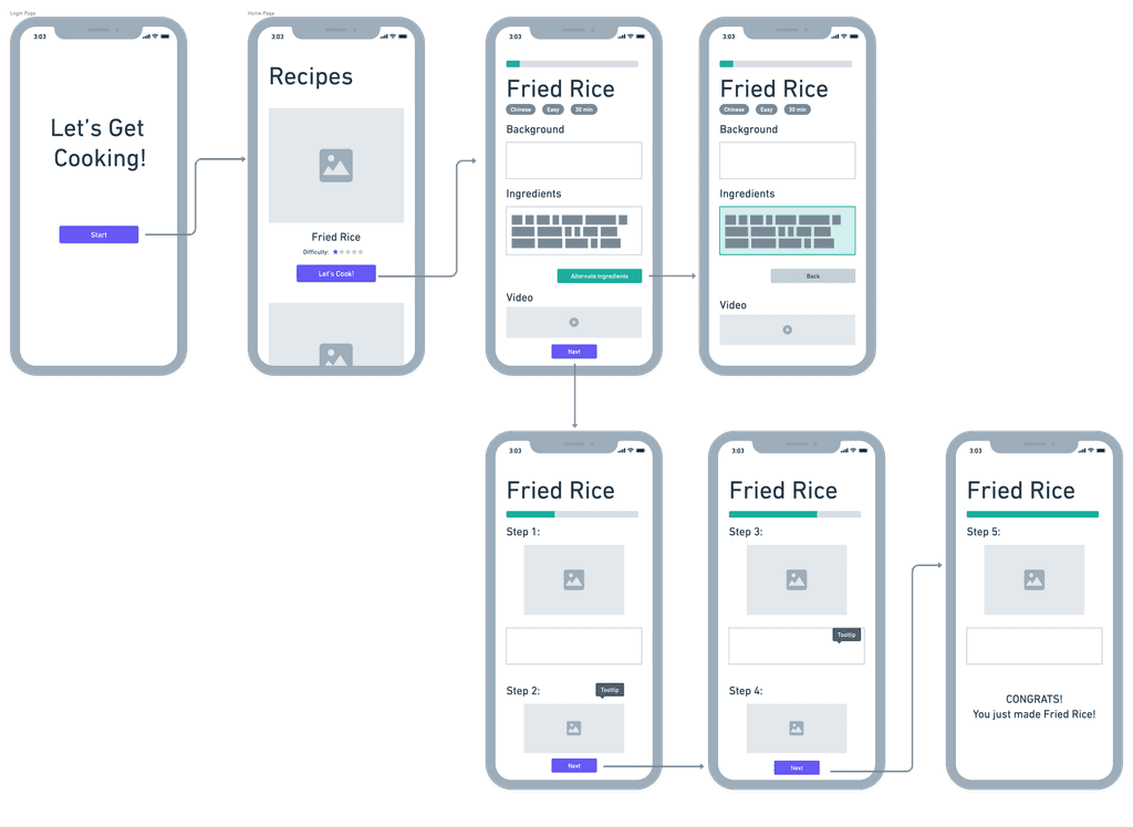
To build the flow of my app, I created a journey map and product flow to understand how a user might navigate my instructable.
My Instructable's journey map
Product Flow
From the journey map, I created the following product flow to further visualize the feel of the app.
My Instructable's product flow
I brainstormed a list of potential features for the app:
A progress bar
Video features
Images at each step
A difficulty bar
Tips throughout the recipe
Ingredient substitutes
A background section
Audio input (hands-free interaction)
Bolded headers
Fun facts / educational info
After a preliminary design critique with 3 participants from my class, I identified the following additional needs:
Dietary restrictions: alternative ingredients list
User navigation: affording users to proceed to the next page
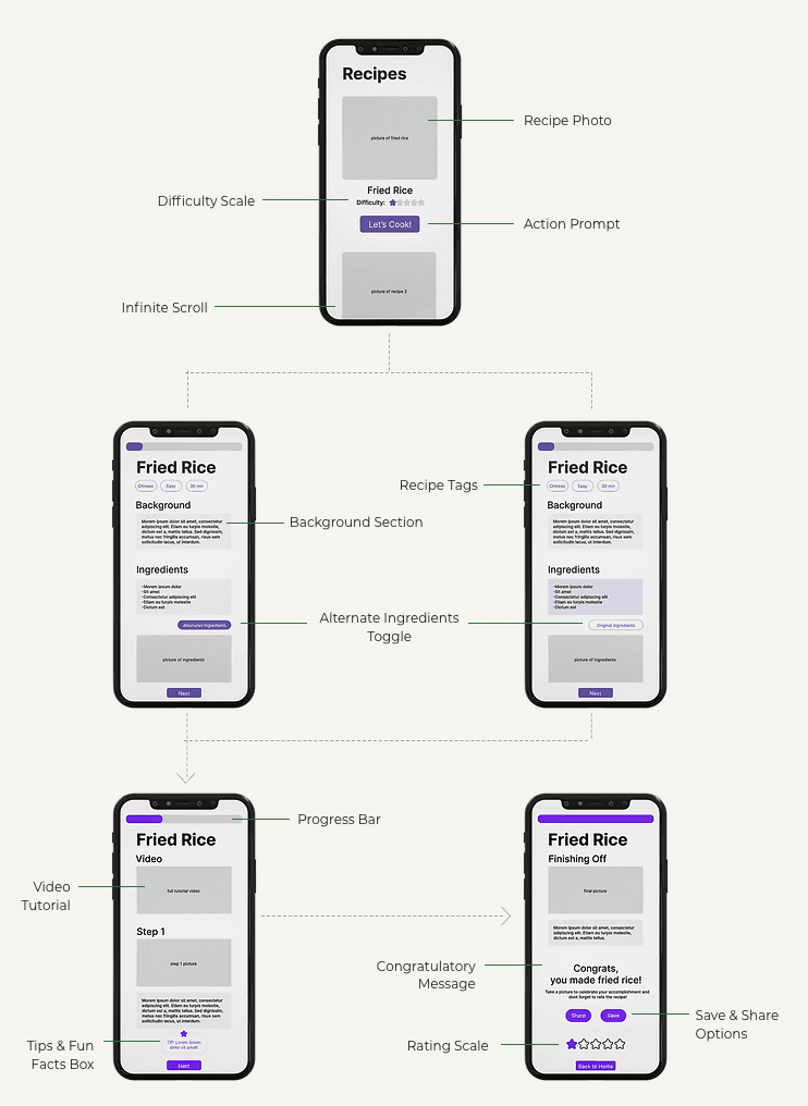
I integrated these needs into features which are reflected in the updated site map.
Updated Site Map
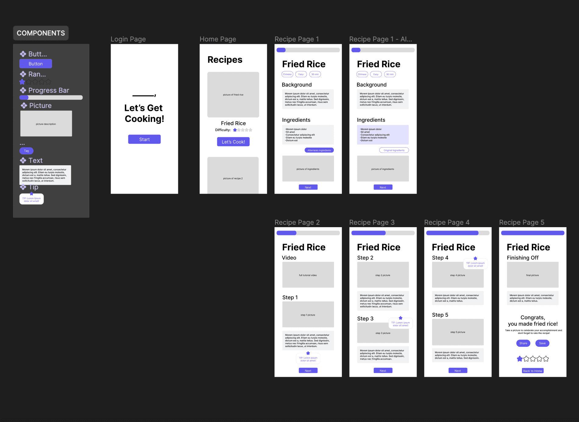
Wireframe Deepdive
Details on the notable features.
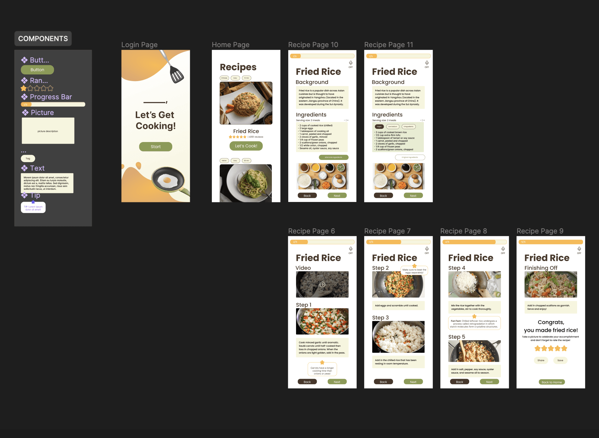
Low-fidelity Wireframes Demo
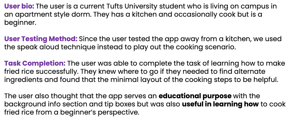
Usability Testing Round 1
I tested my low-fidelity prototype with a second round of user-testing.
With this feedback, I proceeded to work on the high-fidelity prototype and visual identity of my app.
Visual Design & Mood Boards
I first create 3 distinct mood boards to serve as a guidance for the app's visual identity.
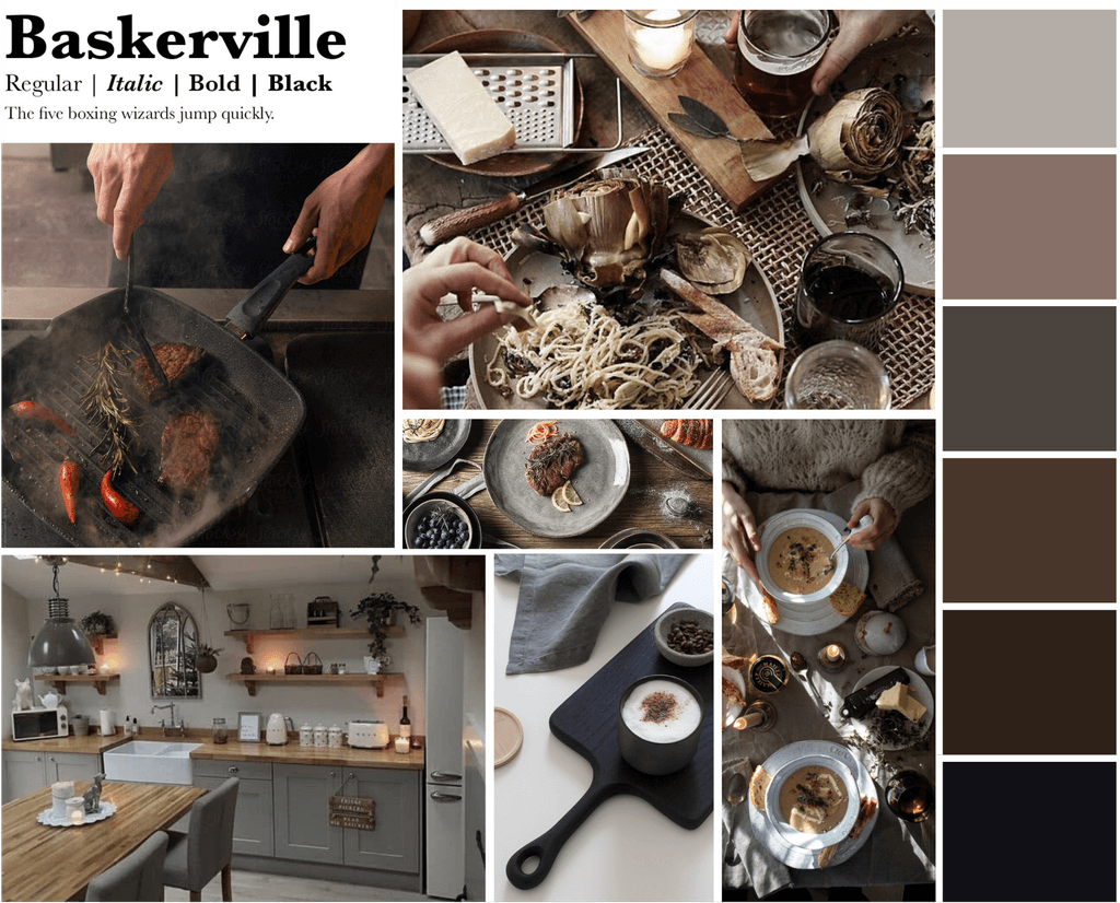
Mood Board 1
Design Rationale
This mood board captures a more elegant aesthetic within cooking. Darker tones are typically associated with classiness and fine dining – this color palette emulates the same essence. Baskerville is a serif font which gives the designs a sense of credibility and professionalism.
Mood Board 2
Design Rationale
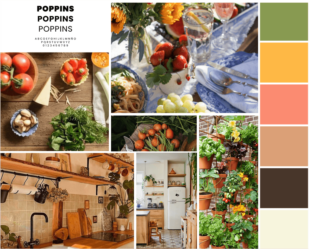
This mood board is a lot more playful – featuring bright and light tones. The bolder colors represent the freshness of raw ingredients and is inspired off home gardens (tomatoes, carrots & greens). The palette is primarily warm toned to appear more inviting. Poppins is a sans serif font which gives the design a more modern feel.
Mood Board 3
Design Rationale
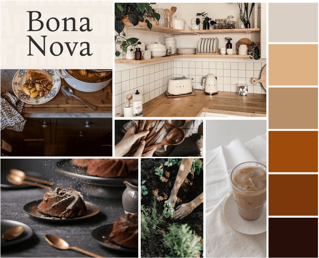
This mood board is brown and warm tone dominated. The main inspiration for this color palette comes from the coziness associated with cooking at home. Since the app is for aspiring home cooks, having colors that resemble a warm home kitchen is appropriate. Bona Nova is a serif font, but its type weight is lighter which gives the design a clean look.
Finalized Mood Board.
Mood board 2 is the finalized choice as it best caters to the target demographic of app's users: aspiring home cooks.
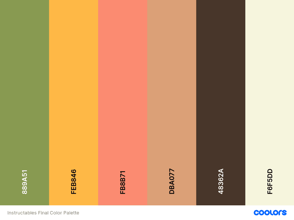
Mood board 2 features bright colors which gives the app experience an air of playfulness and fun associative with the joy of learning how to cook. It also is visually more contrasting which helps keep the users’ eyes engaged.
Finalized Color Palette
Wireframes & User Testing
👩🏻🎨 Putting it all together!
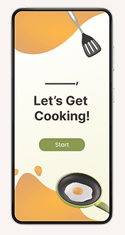
High-fidelity Wireframes Demo
Usability Testing Round 2
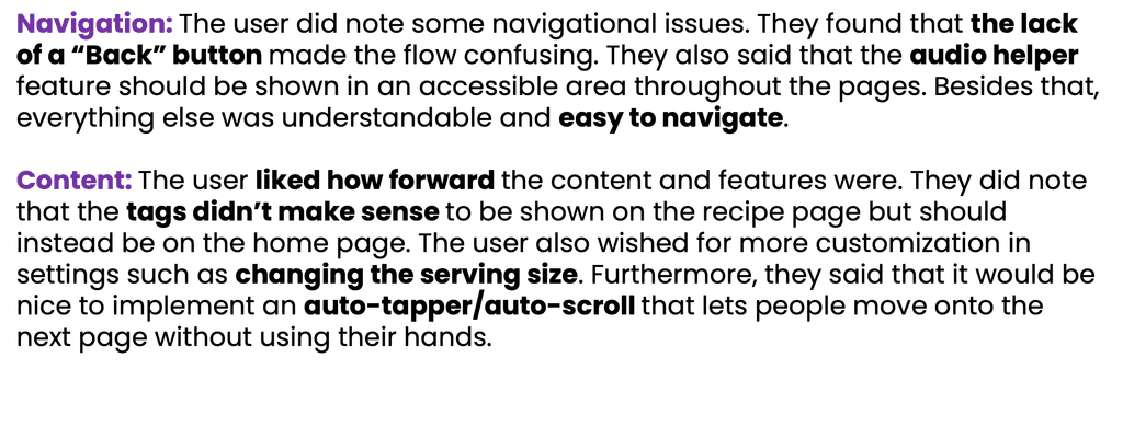
To complete the project hand-off, I tested my high-fidelity prototype with a second round of user-testing.
Key Takeaways & Reflections
This was a very fulfilling project as I got to design an app from ideation to final prototyping. The open-ended project scope allowed me space to explore various problem spaces and I learned a lot about streamlining designs in Figma.
Overall, I learned about:
Using component libraries to standardize visual style throughout the wireframes.
The benefits of having multiple rounds of user testing & how each round informs effective design iterations.
If I had more time, I would:
Explore gamification and how it can be incorporated into a cooking app.
Further develop the community and social sharing aspect of the app.
Refine the unique value proposition of the app & develop more pages for a more comprehensive experience.
